
Are you looking for an innovative new way to brighten up your wall space? LED neon signs are the perfect way to break away from traditional glass neon signs and achieve an eye-catching piece of wall art for any application.
In this guide, we will look at the different fonts you can choose from when creating your own LED neon sign. We will also look at how to choose the right font for your sign and the kind of neon font options you can find at Neon Vibes.
Click on one of the links below to jump to that section:
Different font types
When looking to create your own neon light, one of the primary factors to consider is the font you will use. It may be important that the font fits in with your overall branding, but also bear in mind that different font types can have a variety of impacts when it comes to wall art.
Depending on what kind of message you want to convey and the aesthetic you’re trying to achieve with your custom neon sign, you may wish to mix and match different fonts for different signs or stick with one cohesive look to draw your overall design together.
Serif and sans serif
These fonts are standard when it comes to the written word (you will commonly see Times New Roman as a standard serif font, or Helvetica as a sans serif font) and this is because they are created with clean, simple lines.
Serif fonts will have small flourishes and embellishments on certain letters, while sans serif will not. These are great fonts for more formal signage or signs that need to be easy to read.
Hand-drawn
Hand-drawn fonts are a little more characterful—these are usually created by hand and will make your custom LED neon sign more unique. Hand-drawn signs can vary in their readability but they are excellent for having something more personalised.
Script
While some script fonts can look informal, the beautiful aesthetic style of this font is often used for more up-market settings. Script implies class and good taste, but be careful with the readability of this font, as it can be difficult to read and less accessible overall. It is best utilised for larger signs or single words.
Retro
Retro fonts are inspired by older style fonts that fonts can fall into many categories, from script to sans serif and beyond. This is an easy way to give your signage an old-fashioned appeal and imitate a traditional glass neon sign. Retro fonts can be excellent in a statement piece, but bear in mind that they are not intended for a more modern look!
Novelty
Novelty fonts are a fun way to think outside the box. These fonts work well with signs as they are used to grab attention, falling outside of the major font categories. These fonts can give your sign a unique personality and are brilliant if you want an informal, youthful appeal.
Comic
Comic fonts are attention-grabbing. These fonts are highly accessible and tend to be easy to read, but make sure that you only choose a comic font for a more light-hearted sign, as this kind of signage does not give off a serious tone.
Choosing a font for your LED neon sign
When choosing a font for your LED neon sign, there are several factors that you should consider before making your final choice.
Readability
One of the most important considerations for a neon sign is readability. For example, while a heavily italicised font might look nice, it must still be easy for a reader to know what the letters mean. This is especially important if you are using this for instructional/navigational signage or an important piece of branding.
Formality
You should also consider the formality of your sign. If your business image is friendly and fun, you can go with a less formal font, but if you are offering a more premium or formal service, a serif font might be preferable.
Sign size
Make sure that the font you choose works for the specific size of your sign. A small sign with a script font might not be as readable or elegant as you thought it might, whereas a comic font might overshadow any symbols or logos on a larger sign.
Sign colour
There are other, more aesthetic considerations to think about, such as the colour of your neon sign and whether this helps improve its readability based on where you are placing it. For example, a warm white or yellow neon sign in a cursive font will probably blend into the background if placed against a cream or off-white wall. A brighter colour such as light red would stand out more.
Font options at Neon Vibes
If you want to get the best custom LED neon signs or wall art, then look no further. Neon Vibes offers 36 different font styles for custom LED neon signs, so there will be the perfect one to suit your home or business.
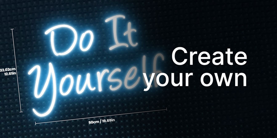
These signs also come in a variety of sizes from 50cm to an impressive 250cm, and you can choose from a variety of colours to help make your custom design pop. You will also be able to choose the backing shape for your acrylic sign, as well as the type of LED you want.
Frequently asked questions
Can channel letters be used in custom LED neon signs?
Channel letters are three-dimensional letters and are commonly used in LED neon signs.
What do you need to make an LED neon sign?
In order to make an LED neon sign, you will need to choose the font you want to use, as well as which colour works best for your sign, and the overall size of it. You can fully customise your sign with a design to suit you, including details like whether you want your sign to be splashproof.
Browse our full collection of neon signs to find the perfect one for your application.